Do you want your home to look like every other neutral, beige-on-beige house on your street, or do you want it to actually reflect who you are?
If your weekend uniform is khaki pants and a plain white polo, bright and bold color schemes probably are not for you, but if you gravitate toward color and pattern in your closet (or even at the office), your home should be doing the same thing. Your walls should not be more conservative than your wardrobe.
Decorating with bright, saturated color can give a home real personality. Done carelessly, though, it can also tip straight into "preschool classroom" or "clown college" territory, and that fear is exactly why so many homeowners default to gray and greige and call it a day. The professional designers at InteriorDesignInfo.com see this hesitation constantly.
Below are the principles that make bold color work in a grown-up home, along with the exceptions worth knowing before you start.
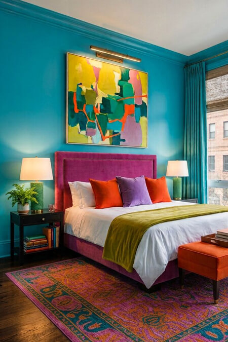 Choose Unexpected Colors, Not Primary Colors
Avoid leaning on pure primary colors (true red, true yellow, true blue) as your main palette since they can read as childish fast, mostly because they are the exact colors used in preschool toys and cartoons. A small dose is fine, but proceed with caution.
Basic secondary colors (orange, purple, green) run into a similar problem when used in their most straightforward form. For a more mature look, reach for the in-between shades instead: emerald green, vibrant turquoise, aqua blue, butter yellow, electric orange, camel, fuchsia, mauve, teal, chartreuse, lime, rust, mustard, steel blue, bright navy, and gold. These colors carry more depth and nuance, which is exactly what separates "sophisticated maximalism" from "kids' playroom."
Do not be afraid to combine colors that seem like they should clash. Some of the best rooms break the supposed rules entirely. Try it before you rule it out, because just adding a few paint samples on a wall almost never tells the full story.
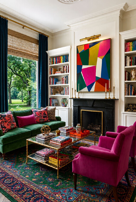 White wall living room with bright and bold colors - AI-assisted image | Human-editedYou Can Use Color As An Accent Instead of the Entire Room
If you are afraid that your bold room might feel like sensory overload, ground it with larger furniture pieces in neutral tones first, then layer your bright colors in through the smaller, swappable pieces.
Sofas, sectionals, and case goods do well in white, black, gray, brown, beige, or a natural wood tone. Save the bold color for pillows, an accent chair, an ottoman, curtains, and accessories. This approach also happens to be the more budget-friendly one. Reupholstering a sofa can run $1,200 to $3,000 depending on fabric and size, while a set of four statement throw pillows typically costs $150 to $400 total. If you are not ready to commit fully, start small.
As a general rule, if you are concerned about color overload, stick with bold color on roughly one quarter of what your eye sees in the room. If you are more daring, or if the room is a powder bathroom where you only spend a few minutes at a time, push that closer to half the room or beyond. Powder rooms are the one space in a home where designers consistently say go bigger than you think you should, since the commitment is low and the impact is high.
You can even have white walls as a base color and build your bright and bold colors from there.
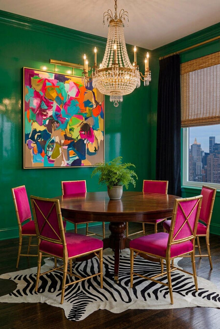 Bold green dining room with zebra rug - AI-assisted image | Human-editedBalance Pattern and Texture to Look More Mature
Pattern choice matters just as much as color choice. Mature patterns (paisley, damask, large scale floral, tartan, chevron, and accurately colored animal print) read as intentional and collected. Juvenile patterns (polka dots, small scale plaid, tiny repeating florals, cartoon-style animal silhouettes, and animal print in unnatural colors like hot pink zebra) tend to undercut an otherwise well-designed room.
Also watch the overuse of location-themed pattern. A little bit of coastal or woodland reference is charming. Fish-print wallpaper covering every wall of a beach house, or bear silhouettes on every pillow in a mountain cabin, starts to feel like a tourist gift shop instead of a home. One touch of theme is a charming nod, but five touches is a costume.
Mix patterns in coordinating colors rather than matching sets. Pair a large scale floral drape with a striped chair and a solid velvet ottoman, for example, and let the shared color palette do the unifying work instead of matching prints doing it. Texture does the same job in a different way - a room built entirely from cotton and polyester in bold colors can still feel flat and a little cheap, no matter how good the color choices are, so bring in velvet, leather, boucle, wool, and metallic finishes to add depth. A velvet or chenille sofa reads instantly more expensive than the same silhouette in a basic poly blend, even at a similar price point.
Balance the boldness with a few neutral, textural anchors, such as a wicker basket, natural wood floors, a stack of hardback books with the paper jackets removed (unless the jacket itself is a keeper), exposed brick, or a set of brass or bronze candlesticks. These grounding elements keep an eclectic, colorful room from tipping into visual chaos.
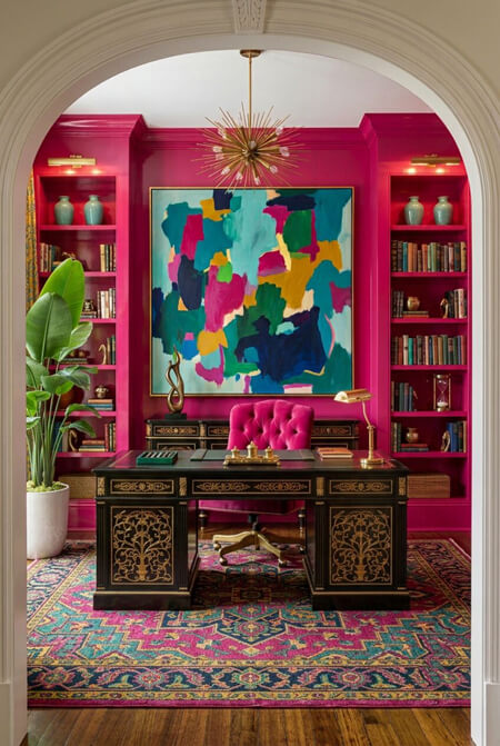 Bold pink home office - AI-assisted image | Human-editedBuild the Room Around a Unifying Piece
Every well-designed bold color room has an anchor. That anchor might be a large piece of art, a bold wallpaper, or a colorful area rug, and its job is to set the palette for everything else in the space.
Pull at least three colors from that unifying piece and repeat each of them at least three times around the room. If the wallpaper has teal, coral, and gold in it, for instance, those same three colors should show up again in the pillows, a lamp base, a vase, and maybe a stack of coffee table books. For added depth, bring in a lighter and a darker version of each of the three colors rather than using them at a single flat saturation throughout.
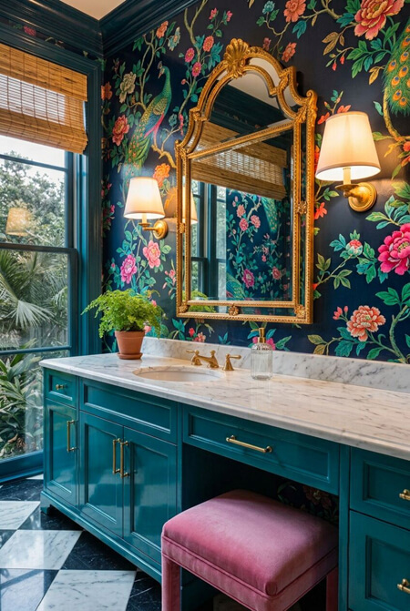 Colorful glam bathroom - AI-assisted image | Human-editedConsider the Lighting
Bold color needs strong lighting to look intentional rather than murky. A saturated wall color in a dim room can read heavy and dated fast, while that same color under good lighting reads rich and current.
Start with natural light. Hang curtains so the rod extends 4 to 6 inches beyond the window frame on each side and mounts close to the ceiling, which lets the panels stack off the glass and lets in maximum daylight when open. At night, and to supplement daylight year-round, layer in artificial lighting through pendant fixtures, floor lamps, and wall sconces rather than relying on a single overhead fixture.
Also keep the color temperature of your bulbs consistent throughout a room. Mixing a warm 2700K bulb in one lamp with a cool 4000K bulb in another will make your wall color shift depending on which fixture is closest, and that inconsistency reads as an error even when the paint color itself was the right choice. Smart bulbs #ad that let you adjust color temperature from an app are worth the investment if you like to change the mood of a room seasonally without repainting.
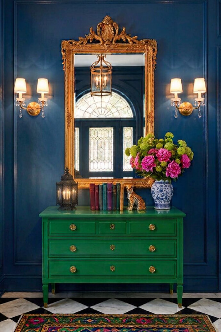 Glam colorful foyer with green console and ornate mirror - AI-assisted image | Human-editedAccessorize Thoughtfully
Once the big pieces are in place, resist the urge to add all of the decor at once. Bring in a few special, high-impact accessories first, ones that genuinely reflect your personality and maybe even create a focal point in the room. Then stop and look at the space for a few days before adding more.
After living with those first pieces, start layering in additional items one at a time, evaluating as you go. If something feels like too much, remove it rather than adding another piece to compensate. Do not keep piling on decor to fix a room that already feels busy, or you will end up further from the sophisticated look you were after, not closer to it.
A home is never really finished. Just as a wardrobe evolves season to season, a well-decorated room should get edited over time too. Walk through your space every few months, remove what no longer feels right, and let it keep evolving.
Bold color, done with intention, does not look juvenile - it looks like someone who knows exactly what they like and was not afraid to commit to it.
You might also like these articles:
No More Mistakes! The Foolproof Guide to Picking Paint Colors
The Impact of Color on Mood: A Guide for Decorating Your Home
Interior Designer Tips & Tricks for How to Add Color to a Neutral Room