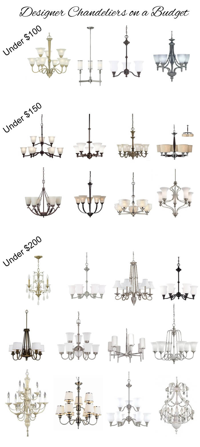
Characteristics of Expensive Homes (and Decorating Mistakes That Make Them Look Cheap)

There are many characteristics of expensive custom homes that are missing from less expensive homes. 

Often times homes in subdivisions are mass produced and the builders cut corners during construction in order to save money and make a greater profit.

Expensive homes are also properly decorated by a professional instead of using popular "one size fits all" items from a local big box store. 

Even if your home was not originally custom, you can change it to make it look more expensive. 

Here are some suggestions to upgrade your home and avoid decorating mistakes that make it look cheap.

 characteristics expensive homesphoto courtesy of Brent Eckley flickr.com/photos/96831183@N08/28665516526

Designer Favorite Kitchen Countertop Accessories - and Items to Avoid!

Many people have strong opinions when it comes to decorating a kitchen countertop. 

Some people will say to only display a maximum of two items while others feel the need to display every beautiful kitchen item that they own. 

My personal opinion is to only keep the items you use at least once a week on your countertops and everything decorative needs to also be functional. 

Typically, the more traditional and casual the interior design, the more items can be on the kitchen countertop. 

The more modern and formal the home, the fewer items should be on the kitchen countertop. 

Here are a few common items that I regularly use to decorate kitchen countertops, as well as what you should avoid.

designer favorite kitchen countertop accessoriesphoto courtesy of Cynthia Crane flickr.com/photos/cynthiacranesart/15011728865

How to Decorate with Gray and Beige in the Same Room

Many of my clients want to use the color gray in their homes that are currently filled with beige tile flooring, beige carpet, and beige furniture that they want to keep. 

Many are concerned that the beige and gray colors will not complement each other, and they are right to be concerned. 

The main reason why beige and gray do not often work well together is because beige is typically a warm color and gray is typically a cool color. 

With proper planning, we can decorate each room in a way that makes the beige and gray look intentional.

How to Upgrade Your Closets Without a Complete Remodel

Almost everyone feels that they do not have enough closet space.  One way to get more closet space is to rework your current closet storage to be more efficient.  While working on your closet layout, you should also consider some simple changes to make your closet more attractive and organized.  Here are a few ways to upgrade your closet without having to do a complete remodel.

how to upgrade your closets without a complete remodelphoto courtesy of Crew unsplash.com/search/closet?photo=EMWgB-BTyh0

Peach, Green, and Gray Victorian Inspired Nursery

The predominant colors of most baby nurseries are baby pink and baby blue. 

The typical prints are polka dots, toile, gingham, chevron, and stripes. 

If there is a graphic print, it is normally a cartoon animal. 


Instead of investing in juvenile decor for your baby's nursery that they will soon outgrow, consider decorating their nursery in a style that will grow with them. 

I have created a Victorian inspired nursery design to present other unique ideas for decorating a baby nursery. 

If you appreciate this design and would like to receive interior design and decorating ideas via email, please subscribe to our mailing list on the right side of the screen.

 Peach Green Gray Victorian Inspired Nursery

AmazonStorefront

Is your home generic and boring? 

 Enter your email address below, then click the subscribe button.